Works / Boston Scientific (BSC) Remote Control (RC) APP
Mobile Application
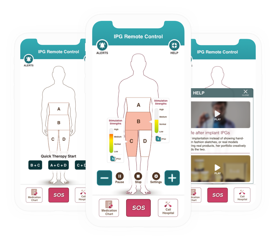
Remote Control.
Client
Boston Scientific.
Project Overview
Intro
Boston Scientific is attempting to create a smartphone app ecosystem that is compatible with the company's cloud infrastructure. The app's key aim is to include all available knowledge about patients' pain sources from their embedded IPG device.
My Role
Senior UX / UI designer, observe the research data and worked closely with stakeholders, work on lo-fid wireframes and interface. A clickable prototype for preliminary usability testing all the solutions.
Goals
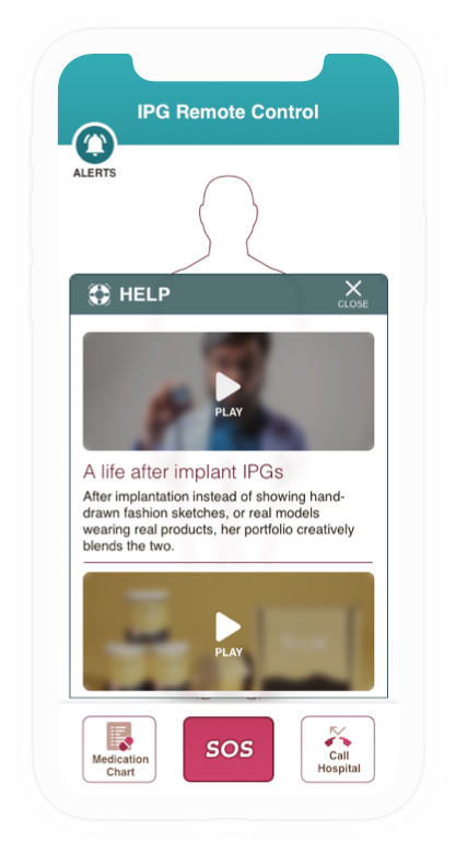
Provides patients with relevant content such as training, how to control the implanted device, and how to live with the implanted device.
Date
Jan 2017 worked at Chennai, India.
Discovery
Research Goals
- Create a smartphone app to replicate the functions of remote control.
- Ecosystem that is compatible with the company's cloud infrastructure.
- All available knowledge about patients' pain sources from their embedded IPG device.
- Provides patients with relevant content such as user learning, training, how to control the implanted device, and how to live with the implanted device.
Stated Problems
- Adjusting the therapy settings a time-consuming procedure.
- Patients must visit the hospital even for any small adjustments.
- The remote IPG was a bit of a hassle to use.
- Doctors do not have access to their patients' implanted devices remotely.
- Doctors can't monitor a patient's on the go because they don't have a history in cloud that is accessible.
Define
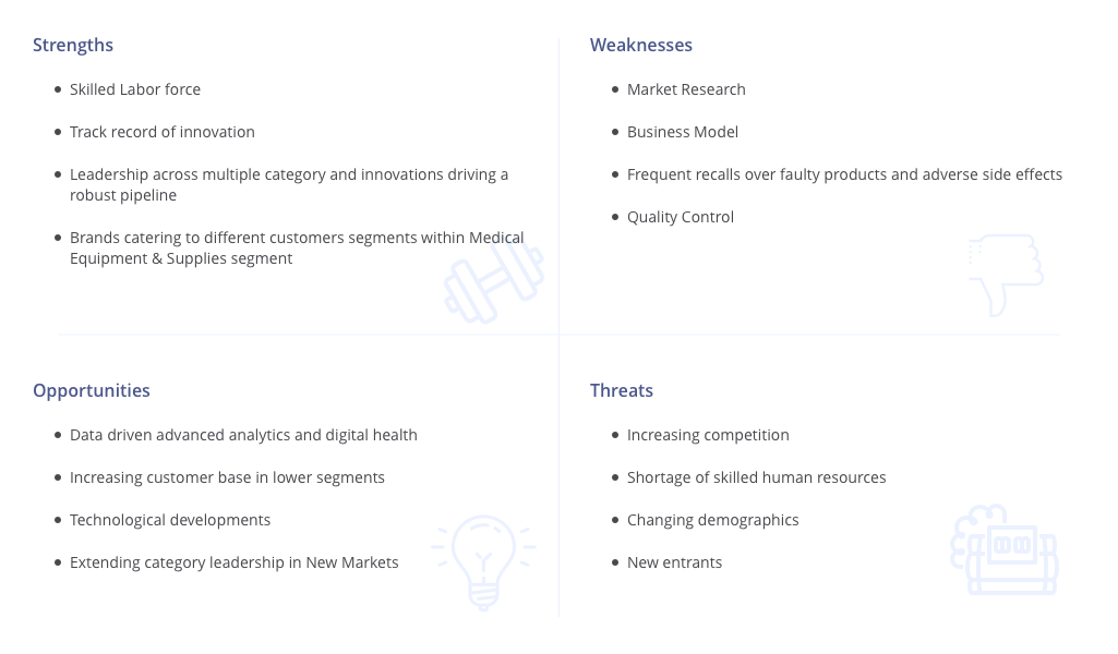
SWOT Analysis
Helps to identify strengths, weaknesses, opportunities and threats which origins from both internal and external factors that are favorable and unfavourable to achieving the objective of the project. The objective are set for this project,
- Live and Control implanted devices.
- Setup a cloud ecosystem for patiens medical and other datas.
Competitor Analysis
A useful tool to understand the market landscape and helps us to identify alternative ways solve the problems faced by prospective customers. It is also a great way to evaluate other competitors’ strategies so you can assess their strengths and weaknesses. We have used few of the analysis,
- Competitor profile.
- Competitor scorecard.
- Features analysis.
By installing few of the competitors apps allow us to untapped resources to enhance usability and accessibility gaps though they don't perform seamlessly because there's no implanted device to interact with but this excersis helped structure the RC app.
Know Your Users
Research team did a combination of multiple studies on the user groups by conducting ethnographic & demographic studies, provide a great inside of the users and their pain points.
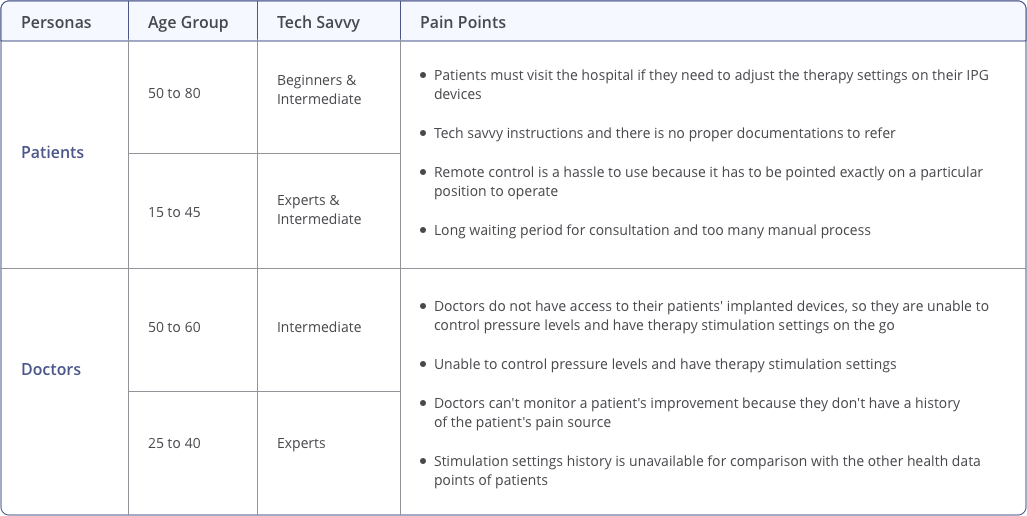
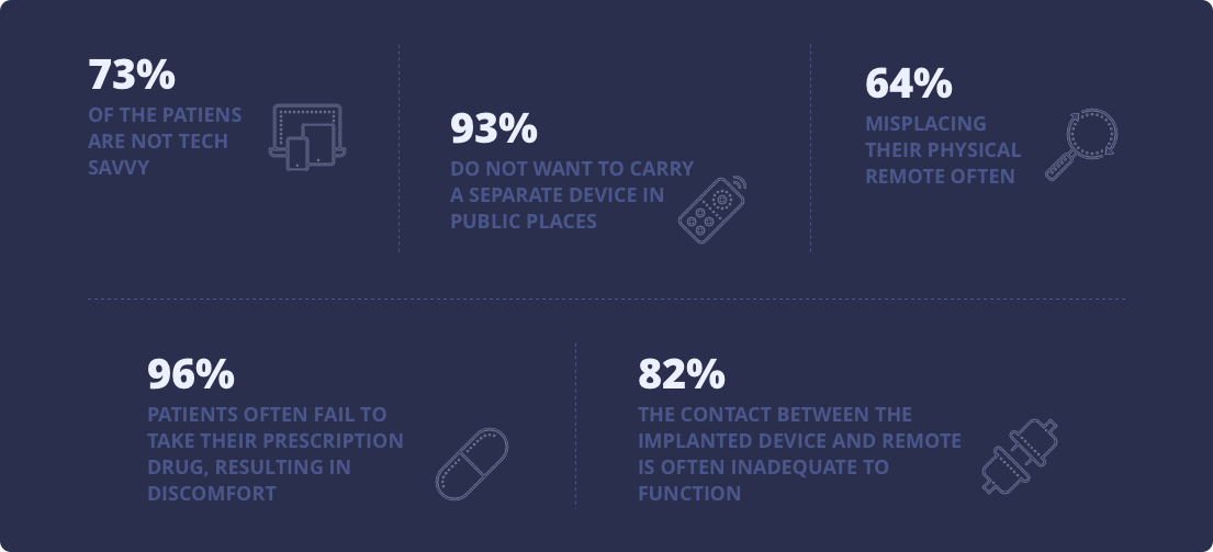
Key Findings
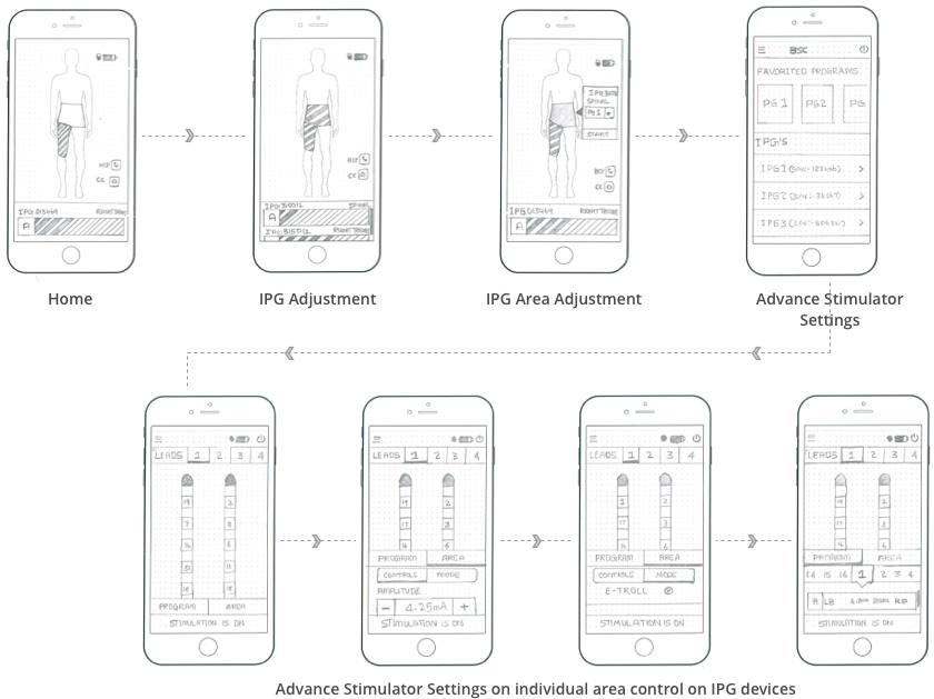
Task Flow Diagram
Design Factors Considered
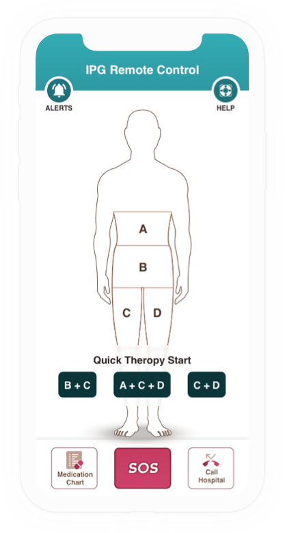
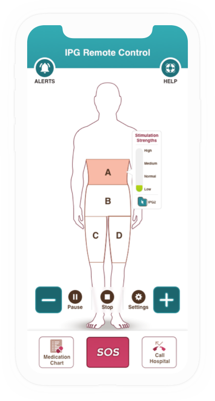
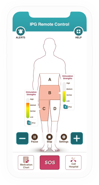
A few design aspects based on the key analysis findings and from his research team's data. Such as the app's ease of use. All demographics should be able to accessible to interact with therapy settings.
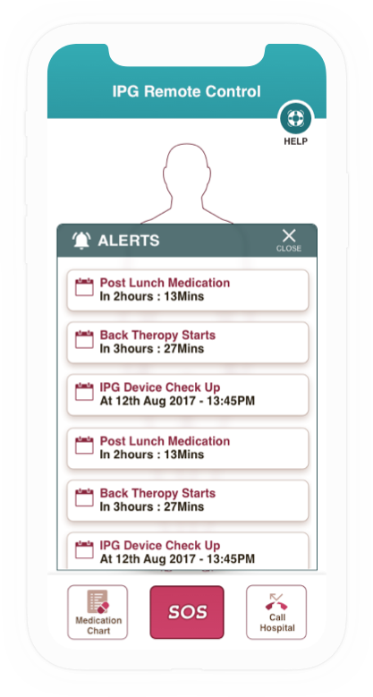
- A single click solution to notify physician and emergency service on a critical situation.
- Therapy and medication remainder.
- Notification patients when there are new therapy settings based on the pain status and adjust device’s therapy frequencies.
- Mobile accessibility factors that are consider like button size and spacing on key controls are reachable in a single hand usage.
A study conducted on ‘Touch Screen button size and spacing’ provides a clear button standards which works for all age groups. The button range goes from 42-60-72px for low-mid-high priority of buttons.
Visual Solution

My Take Away
I had prior experience designing applications for the health care (HC) industry, but this project provided a unique viewpoint on the HC B2C domain. The most important lessons he learnt is how to scope the work flow as an app is to be targeted for different audiences and how an interface can assist people with serious illnesses. In such a mobile app, usability can be highly critical. The form and placement of a single button may have a big impact on users. In such mobile apps, the colour combination and simple notifications brings a significant impact for users with serious illnesses.